Unlocking Graphic Design: A Beginner’s Guide to the Basics
Graphic design is a valuable skill that’s in high demand today. People care about how things look, whether it’s an ad, a website, a logo, or even social media posts. Every business or individual needs eye-catching designs to grab attention. The good news is, you don’t have to be a professional designer to create content that stands out. With modern tools, you can easily add design elements to your photos with just a few taps on your phone.
But having the right tools is just one part of the process. The real challenge is knowing what design choices will make your work look better and more effective. You need to understand what works and what doesn’t when it comes to making your message clear and engaging.
To help you get started, here are eight simple design principles to keep in mind when creating visuals. These basics will guide you in making smarter design decisions and help you craft beautiful, shareable graphics. Plus, you’ll find some templates to kickstart your design journey!
However, if you’re looking for professional and polished designs, utilizing a Graphic Design Service can be an excellent choice. These services provide expertise in creating high-quality visuals tailored to your brand’s unique needs. Whether you’re designing for marketing, social media, or branding, a skilled designer can take your concepts to the next level.
What is graphic design?
Graphic design is a creative skill that mixes images, text, and illustrations to share ideas or messages. It uses simple rules and techniques to make these messages clear and visually appealing.
This skill is often used in marketing and advertising to help brands and businesses stand out. For example, when you notice a logo, flyer, or social media ad that grabs your attention, that’s graphic design at work. It’s a way of communicating through visuals that make people stop, look, and understand the message.
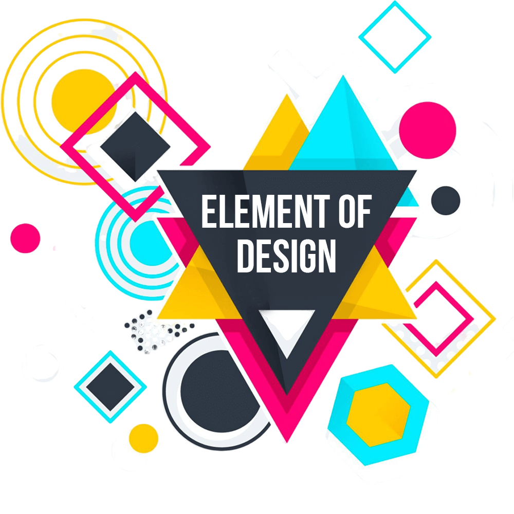
What Are the Key Elements of Graphic Design?
Graphic design has a few main parts: line, shape, form, texture, space, images, typography (text styles), and color. Each of these is important on its own, and learning about them separately can help you understand how to use them together. When you combine these elements, you can create amazing and creative designs,
1. Line
Lines are like the building blocks of design. They can be straight, curved, smooth, zigzagged, or even broken. Lines aren’t just for making outlines or separating content—they can do so much more. For example, lines can show movement, connect different parts of your design, or guide the viewer’s eyes to important areas. Whether bold or delicate, long or short, lines add structure and energy to any design. They are a simple but powerful tool to make your designs stand out.
2. Shape
Lines are often used to create shapes in design. These shapes can be geometric, like circles and squares, which are usually made with tools like rulers or design software. They can also be organic, like shapes you see in nature, drawn freely by hand.
When you’re designing something like a logo or creating your own shapes, it’s important to make sure everything looks neat and balanced. Design software can help you align and adjust shapes to make them symmetrical and even. Using lines to build shapes gives your design structure and helps create patterns or forms that are pleasing to the eye. Don’t be afraid to experiment—lines and shapes are key to bringing your ideas to life.
3. Form
When you turn a shape into something three-dimensional, it becomes a form. Form is an important part of graphic design because it adds depth and makes your designs look more realistic.
Forms can be geometric, like cubes and spheres, which feel organized and clean but can sometimes look too plain or cold. On the other hand, organic forms, like shapes from nature, feel softer, more natural, and alive.
Adding form to your design helps create different emotions or feelings depending on what you’re making. For example, a geometric form might work best for a modern, professional look, while an organic form might be better for something creative or comforting. Using forms well can make your designs stand out and feel more dynamic.
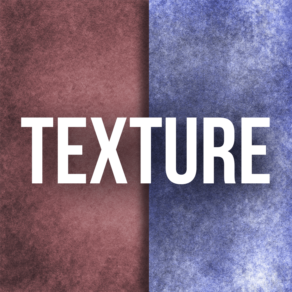
4. Texture
Texture is what gives your designs a feeling of surface or touch, adding extra depth and detail to your work. It can make your designs more captivating and dynamic by giving them a realistic, three-dimensional appearance.
There are several techniques to add texture in graphic design. For example, you can create your own brushes to add roughness or smoothness to lines. You can also draw your own patterns or use special tools to create effects like grain or noise. Another way is to blend colors together to create a textured look.
However, adding texture, especially to illustrations, can take a lot of computer power, so you’ll need good design software and a strong computer to do this effectively. When done right, texture can really bring your designs to life and make them more engaging and unique.
5. Space
When creating your designs, it’s important to think about both positive space (the main part of your design) and negative space (the background area).Both of these spaces are important for shaping how your design appears and how it makes people feel.
You can get really creative with how you use positive and negative space. For example, you can make the main part of your design appear to move back into the background as the viewer’s eyes follow it. Alternatively, you can use the background space to draw attention to certain shapes or elements, making them stand out more.
The way you balance and play with these spaces can add depth and interest to your design, making it more visually engaging.
6.Imagery
If a picture is worth a thousand words, knowing how to use it wisely helps you get your message across more clearly and effectively. The first step is deciding what type of image works best for your design: a photograph to add a sense of reality, an illustration to explain key points, or icons to help viewers understand the message more easily.
For a design that flows well, choose images that fit the theme, express the right message and feeling, and appear genuine. Avoid using overly staged stock photos, blurry images, or anything too complex to understand in the context of your design.
Once you pick an image, you can adjust it in several ways to fit your design better:
- Cropping the image can change how it feels. A close crop can make the image feel more personal or abstract.
- Framing and positioning the image is important too. If you put a border around the image, it will stand out like a separate object. But if you let the image fill the whole space, it will feel more engaging and immediate.
- Editing the colors of the photo can help match it with the rest of your design, ensuring it fits in with the colors and tone of your other elements.
Using images thoughtfully in your design can make it much more effective and appealing to your audience.
7. Typography
Many designs include text, so typography is an important part of graphic design that you need to understand. It can be tricky to find the right balance between choosing a fancy font to set the tone and using something that is easy for everyone to read.
When picking fonts, it’s important to choose the right style for each part of the design. For titles and headings, a display font works well because it grabs attention. However, display fonts can be hard to read in long blocks of text, so for body text, you should use simpler fonts like serif or sans serif, which are easier to read.
No matter which font you choose, make sure it offers different sizes, weights (like bold or light), and thicknesses. If you want to use small caps (capital letters that are smaller than regular ones), check that the font includes this option. Avoid just reducing the size of regular capital letters because it doesn’t look good.
If you want to mix different fonts, some designers recommend using just two or three different styles to keep your design from looking messy. Others feel you can be a little more adventurous with the fonts you choose. The key is to select fonts that have something in common, so your design doesn’t look confusing.
How you position the text is also important. For example, you could start your text with a large letter, known as a dropped capital, which gives your design a more classic, literary feel. But no matter what you choose, always make sure the text is aligned properly with the grid and the other elements in your design.
Remember, typography can be customized to suit your design better. You can adjust:
- Leading: The space between lines of text.
- Tracking: The space between all the characters in a section of text, usually used for capital letters.
- Kerning: The space between specific letters, which is mainly used for headings or display fonts.
By paying attention to these details, you can make sure your typography is not only readable but also visually appealing.
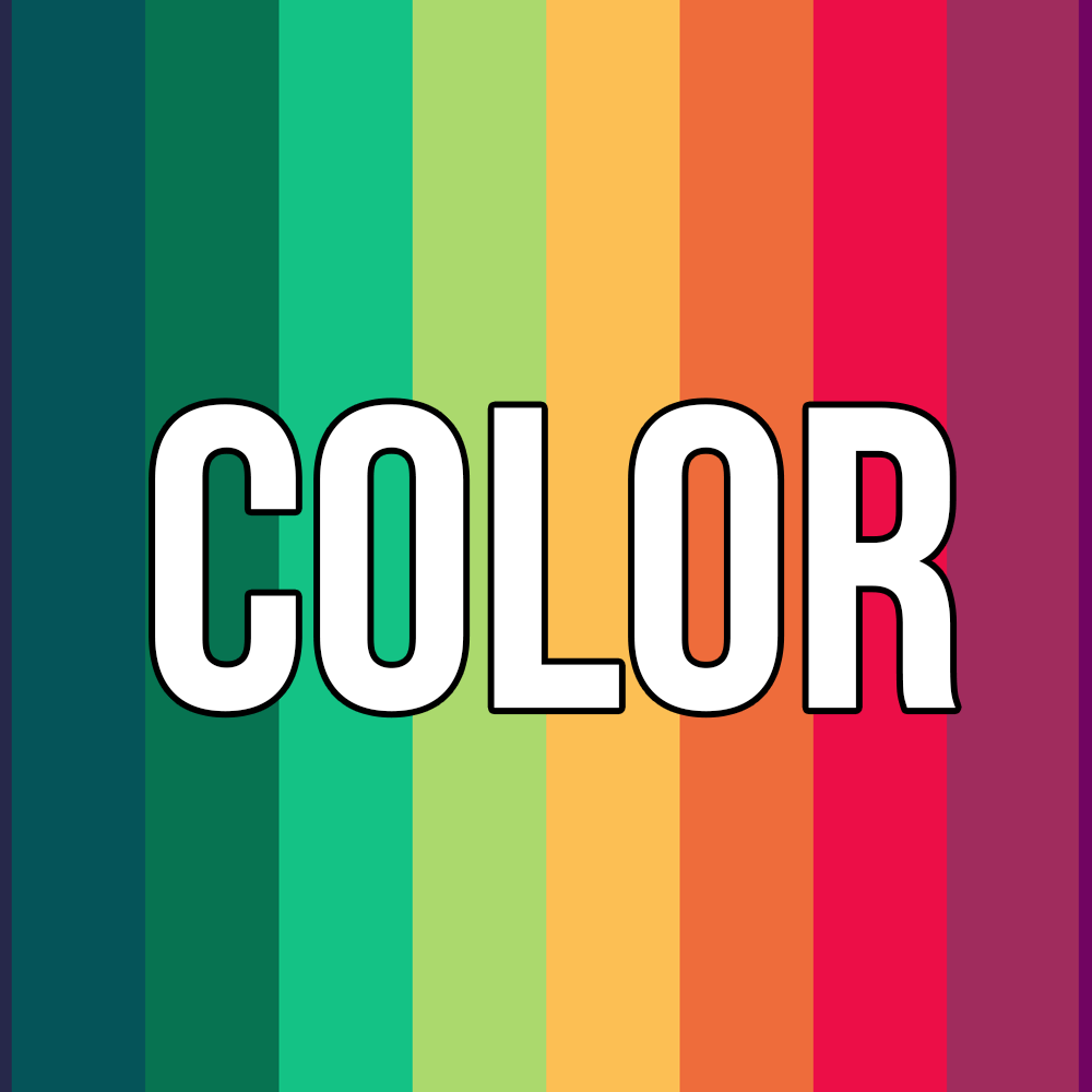
8. Color
When it comes to picking colors for your design, it might seem like there are endless possibilities, but there’s a simple way to make sure your colors work well together: understanding the color wheel. The color wheel helps you pick colors that look good next to each other, like complementary colors (which are opposite on the wheel), triadic colors (which form a triangle on the wheel), or monochromatic colors (which are different shades of the same color).
As a beginner, it’s a good idea to start with either warm colors (like reds, yellows, and oranges) or cool colors (like blues, greens, and purples) rather than mixing both, as this will help your design feel more harmonious.
If you want to get into the theory of color and contrast, it’s a great skill to develop, but you don’t have to do it all on your own. There are tools that can help you choose the right color palette. For example, Color Hunt has a wide range of color schemes, and you can easily copy and paste the hex codes into your design software. Another tool, Coolers, lets you generate color combinations until you find one you like, and you can lock a color you like while generating new options for the rest.
Before you pick your final colors, think about where your design will be used. If it’s going to be printed, sticking to fewer, simpler colors can save money. If it’s for a website or app with interactive elements, you also need to consider how the colors will change when users hover or click on them.
Read More , What is Digital Marketing
How to Combine Your Graphic Design Elements Effectively
The next step in creating effective graphic designs is learning how to make all the elements work well together to form a cohesive, clear composition. Here’s how to do it:
Alignment
A great way to start designing is by using a grid that already has margins and spaces set up. Think of it as the blueprint for your design. It gives you a structure to follow and helps keep everything in place. As you add your design elements, make sure they are aligned with each other and the grid. This simple rule makes your design look neat, professional, and easy for your audience to understand.
Knolling
One important design principle is making sure elements are arranged in straight lines, either parallel or at 90-degree angles to each other. This technique, known as “knolling,” is often seen in tidy and visually appealing layouts, like those on Instagram. It makes your design feel organized and balanced.
Hierarchy
Creating a visual hierarchy helps guide the viewer’s attention in the right order. Instead of just making everything big or using loud fonts, you can organize your design with smaller elements and different styles to signal importance. Here’s how you can do it:
- Scale: The biggest item will catch the most attention, so use it for the most important part of your design.
- Color and Contrast: Bright or bold colors draw attention, so use them for key information. Softer, more neutral colors can be used for secondary details.
- Contrasting Styles and Shapes: To make certain elements stand out, use a style or shape that’s different from the rest of the design.
Balance and Symmetry
Balance is essential in creating a design that feels stable and harmonious. There are three types of balance:
- Symmetrical Balance: This is when everything is equally balanced on both sides. People naturally find symmetrical designs pleasing to the eye.
- Asymmetrical Balance: This is when the design uses elements of different sizes and shapes, but the overall design still feels balanced. This style keeps things interesting and can make viewers pay more attention.
- Radial Balance: This is when elements are arranged around a central point, drawing attention toward the middle of the design. It works well for logos and icons.
Read More : Social Media Management Tips
Balancing Art and Science
Graphic design is a creative process, but there’s also a science behind it. To make sure your message is clear, you need to understand how to use the right design elements effectively. Think of the basic rules as helpful guidelines rather than strict rules. Once you understand them, you can bend or break them to make your design even more powerful.
By understanding and using these elements, you can create designs that not only look great but also communicate your message clearly and effectively. If you need help, our graphic design service in Canada can guide you through the process, ensuring your designs stand out and effectively represent your brand.
Graphic Design Basic (F.A.Q)
1. What is graphic design?
Graphic design is the art of creating visual content to communicate messages. It involves using typography, images, colors, and layouts to design logos, websites, advertisements, and other visual media.
2. What are the key principles of graphic design?
The key principles of graphic design include balance, contrast, emphasis, movement, pattern, rhythm, and unity. These principles help create designs that are visually appealing and effective in conveying a message.
3. What tools do graphic designers use?
Graphic designers typically use software like Adobe Photoshop, Illustrator, and InDesign to create designs. Other tools include Sketch, Figma, and Canva for web and digital designs.
4. What is typography in graphic design?
Typography refers to the art of arranging text in a way that enhances the design. It involves choosing the right fonts, sizes, spacing, and alignment to make the text readable and visually appealing.
5. What is the color theory in graphic design?
Color theory involves understanding how colors interact with each other and how they can be combined to create a harmonious and effective design. It includes the use of complementary, analogous, and triadic color schemes to evoke specific moods.
6. What is a design concept?
A design concept is the overall idea or theme that guides the creative process. It includes the purpose of the design, the target audience, and the message you want to communicate, shaping how you choose colors, fonts, and layouts.
7. Why is alignment important in graphic design?
Alignment refers to the positioning of design elements in relation to each other. Proper alignment creates a sense of order and structure, making the design look organized and professional, while poor alignment can make a design feel chaotic.
8. What is a visual hierarchy?
Visual hierarchy is the arrangement of elements in a design in a way that guides the viewer’s attention. It’s achieved through size, color, contrast, and positioning, helping the viewer navigate the design and understand its importance.
9. How do I balance elements in graphic design?
Balance in design refers to distributing visual weight evenly across the composition. You can create balance using symmetry, asymmetry, or radial arrangements, depending on the mood and message you want to convey.
10. What is the role of white space in design?
White space (or negative space) is the empty space around and between design elements. It helps to create a clean, uncluttered design, giving the eyes a place to rest and improving readability and focus.